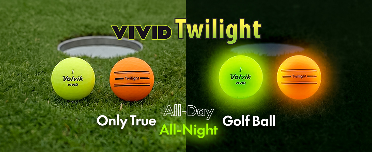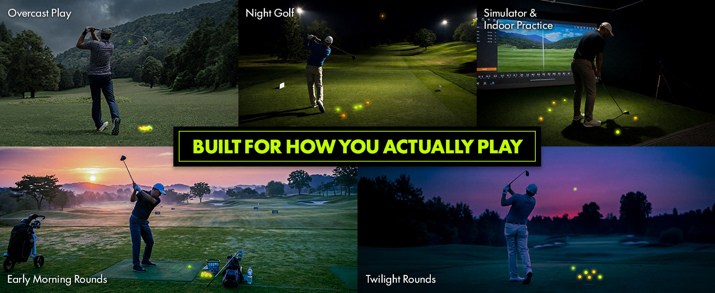
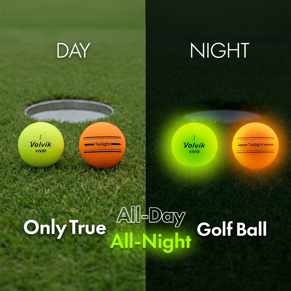
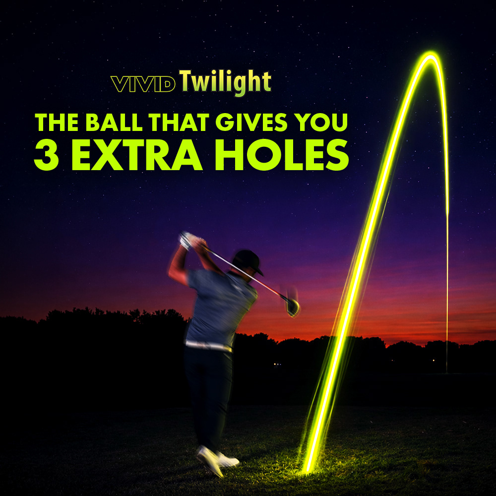
To address the issue, I focused on visually amplifying its core strength—high visibility in any lighting condition. A neon yellow-green color palette, inspired by the ball itself, was used as the primary visual language, paired with strong contrast to enhance visibility and draw immediate attention. This approach ensured both consistency across assets and a clear, impactful product story.
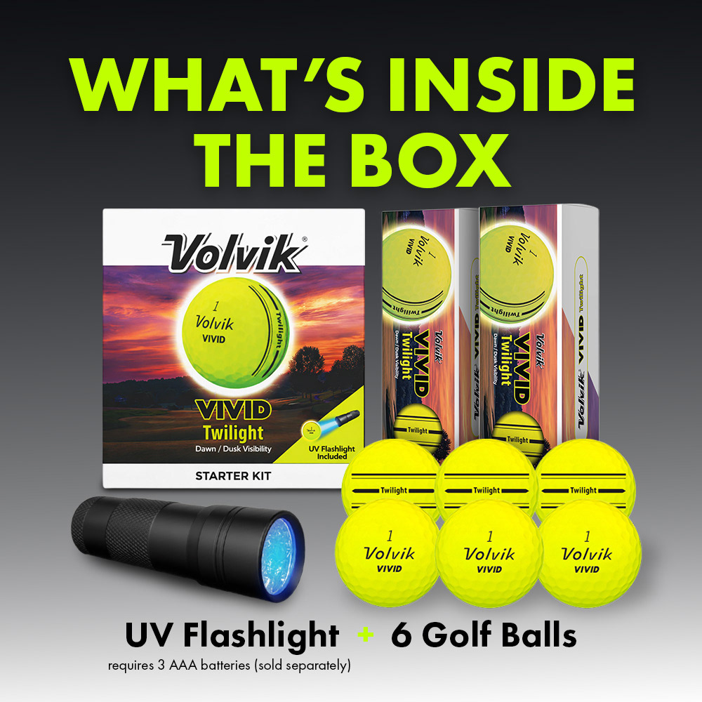
I tried to maintain consistency across both the listing images and the A+ content so that the ball features are highlighted throughout the product page.