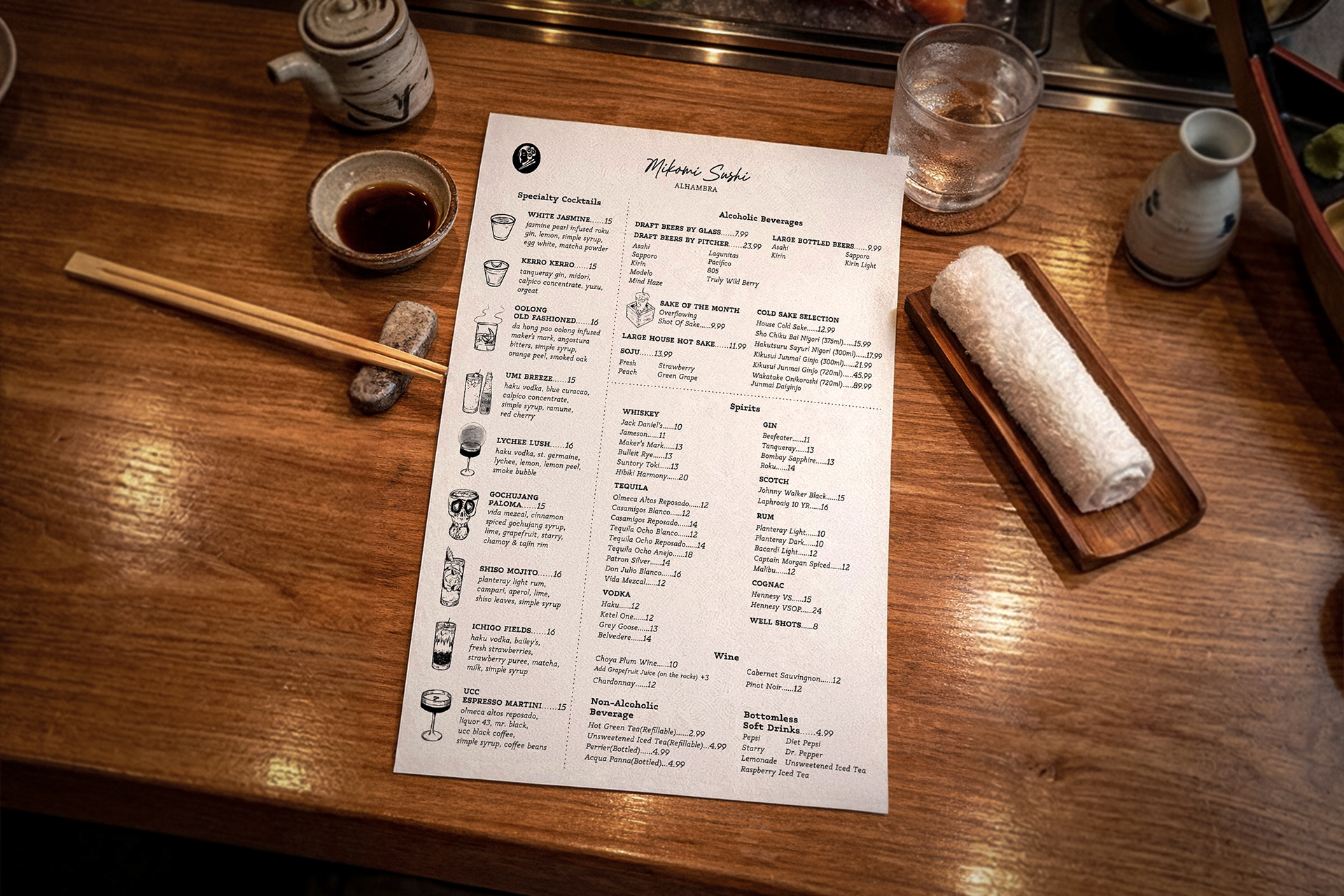
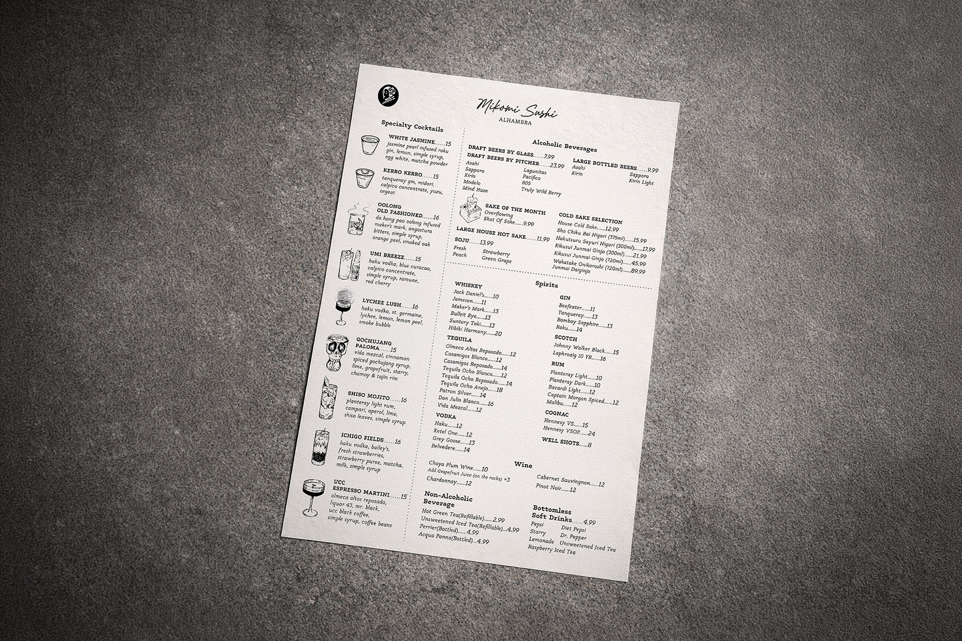
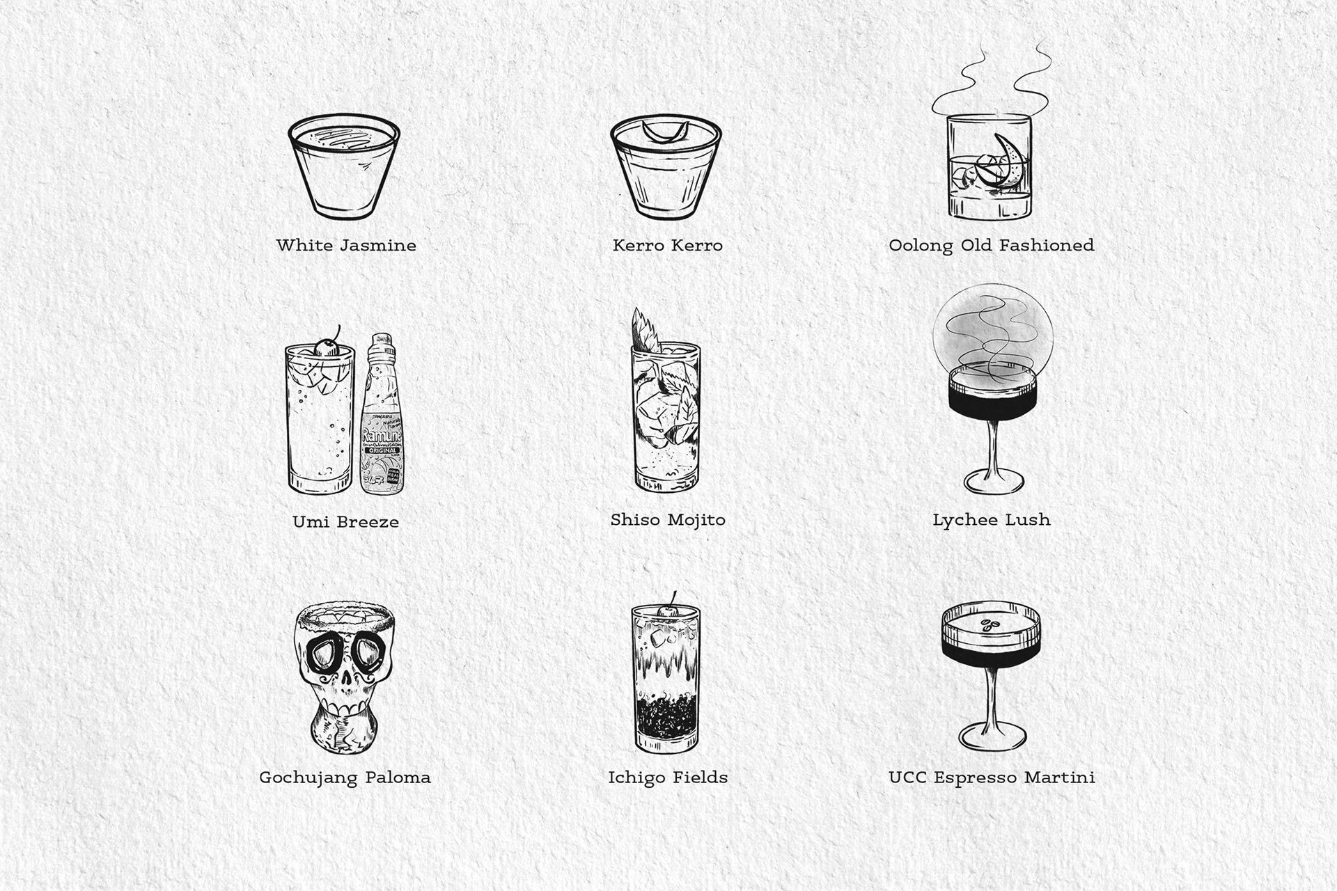
The main challenge was organizing a large number of menu items within a single page while maintaining clarity and visual balance. To address this, a structured layout system was developed using dotted lines to separate major categories, creating clear visual groupings without overwhelming the design. Signature cocktails were positioned on the left alongside hand-drawn illustrations to enhance visibility and create a strong focal point. Typography was carefully adjusted through variations in weight and hierarchy, allowing different sections to be easily distinguished while keeping the overall layout clean and cohesive. This approach ensures that the menu remains both visually engaging and easy to navigate in a real dining environment.
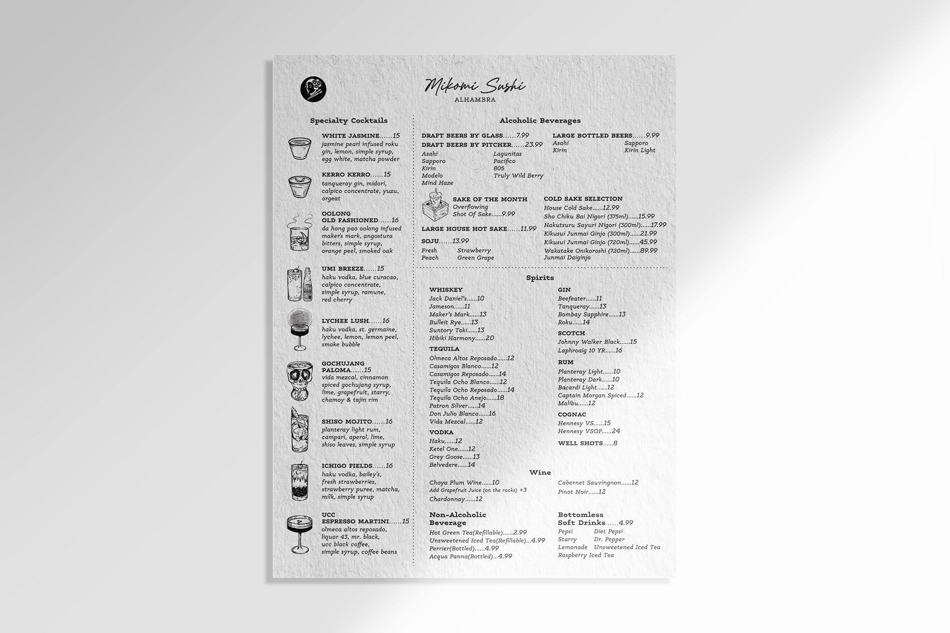
Typography played a key role in establishing the overall tone of the menu. A handwritten-style typeface was applied to the “Mikomi Sushi” logotype to create a modern and relaxed atmosphere. A typewriter-style font was used throughout the menu to introduce a subtle retro quality while evoking an Asian character. Combined with the hand-drawn illustrations, these typographic choices contribute to a warm, soft, and cohesive visual experience.
This combination of typefaces balances personality and readability, enhancing both the visual identity and usability of the menu.