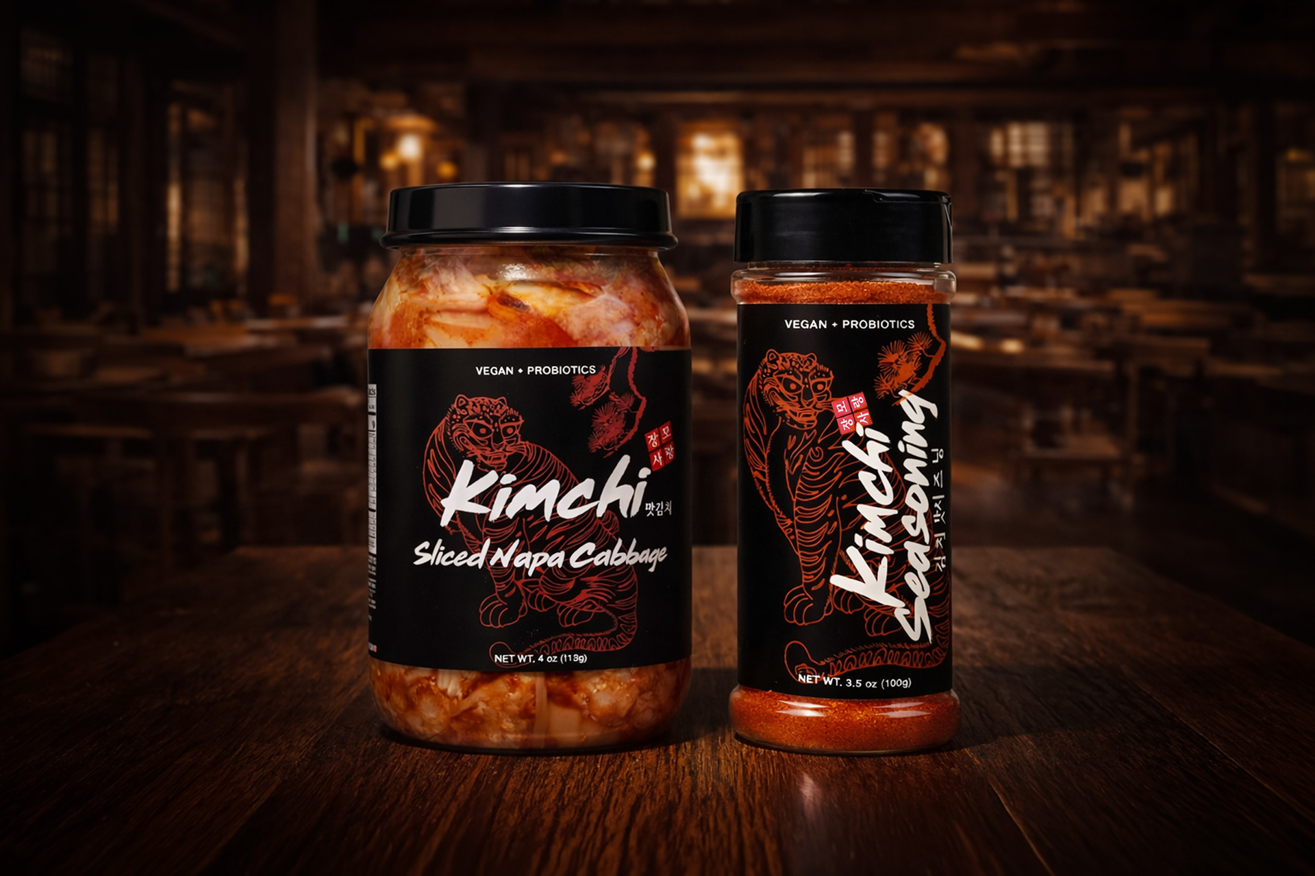
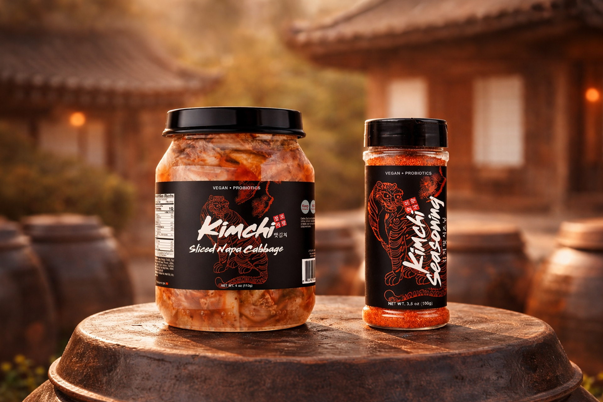
In addition to label design, visual direction was developed to position the product within a traditional Korean context. Warm lighting, earthenware textures, and references to hanok architecture were used to create an authentic and culturally grounded presentation.
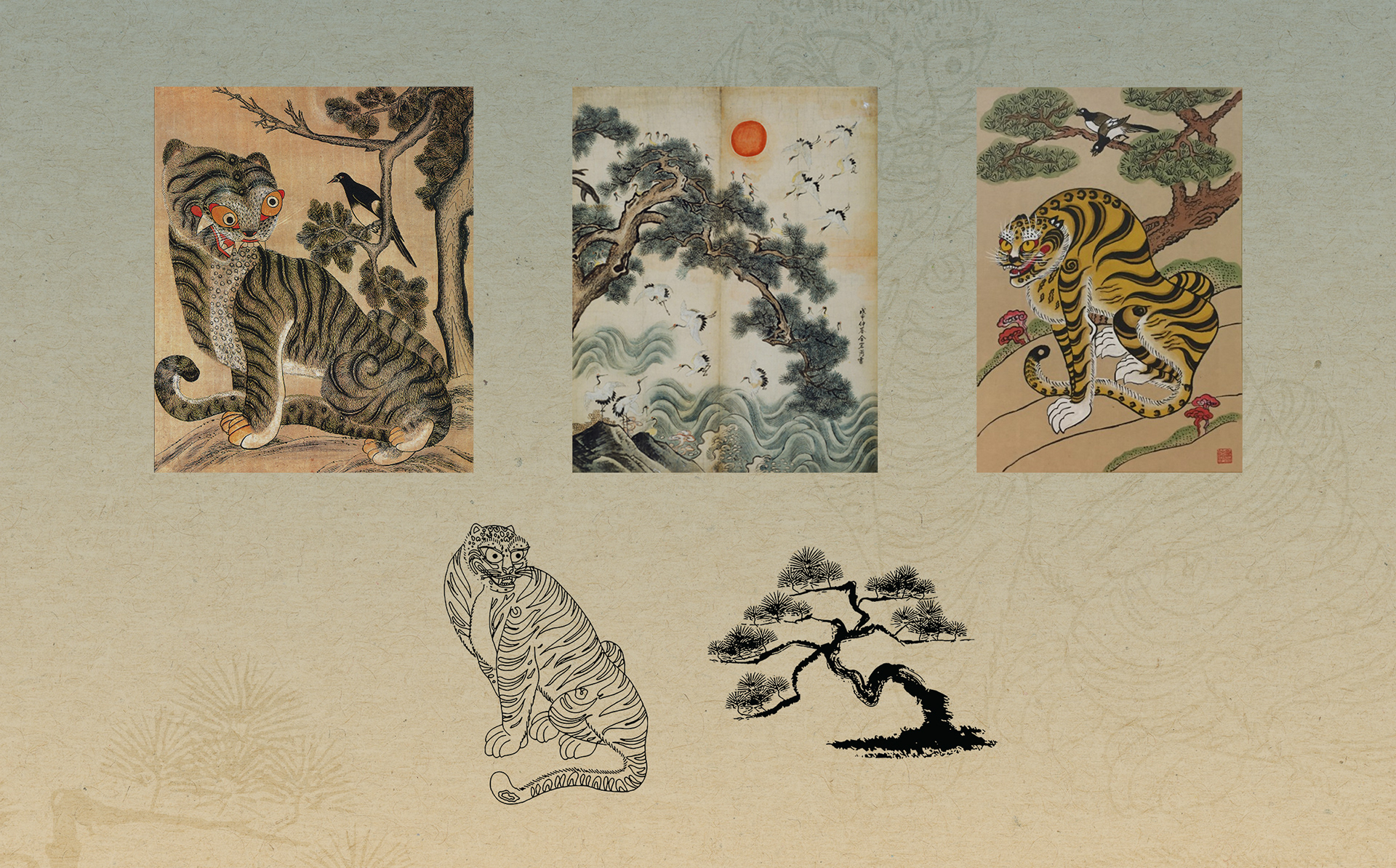
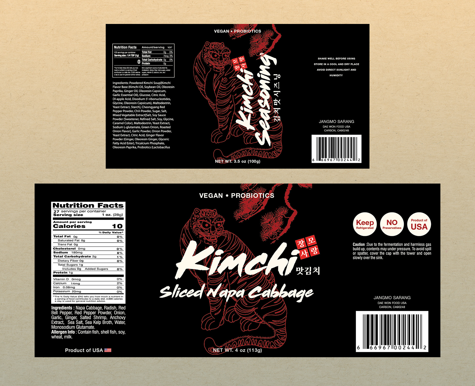
The design concept draws from traditional Korean folk art, incorporating tiger and pine tree motifs to convey cultural symbolism and heritage. These elements were layered to create a unified, illustration-like composition, reinforcing the authenticity of the product while giving it a distinctive visual presence. These motifs were applied across the label to create a strong visual focal point and establish a recognizable brand identity.
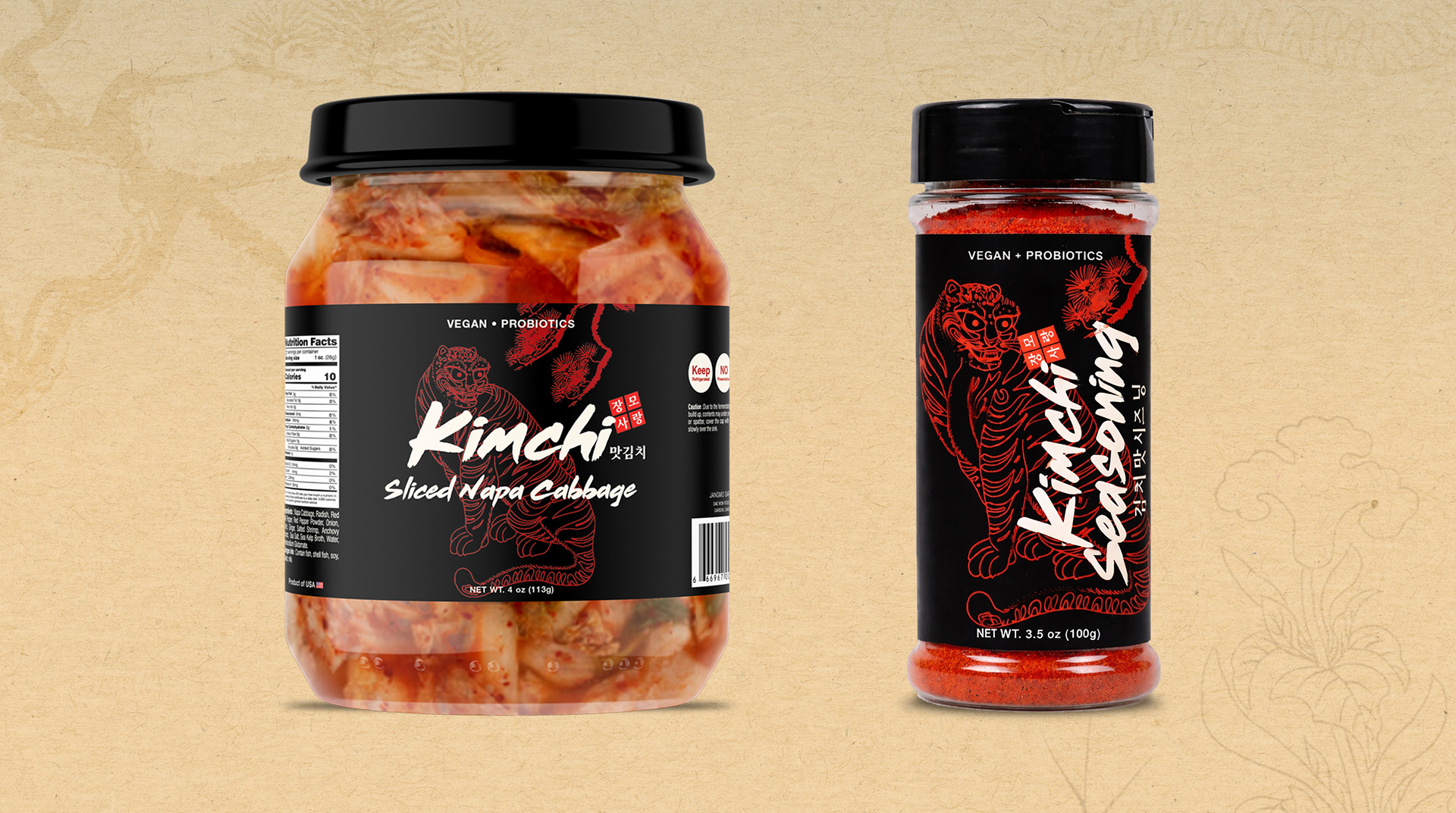
To express the bold and intense character of kimchi, a high-contrast color palette was used, featuring a deep black background paired with vivid red linework. This combination enhances visual impact while maintaining a strong, modern aesthetic.
Typography was selected to further support this concept. A rough, brush-style typeface was used for the main title, echoing the expressive quality of traditional ink strokes while adding a contemporary, dynamic edge. Together, these elements form a cohesive packaging system that bridges tradition and modernity, transforming a familiar cultural product into a bold and refined brand experience.